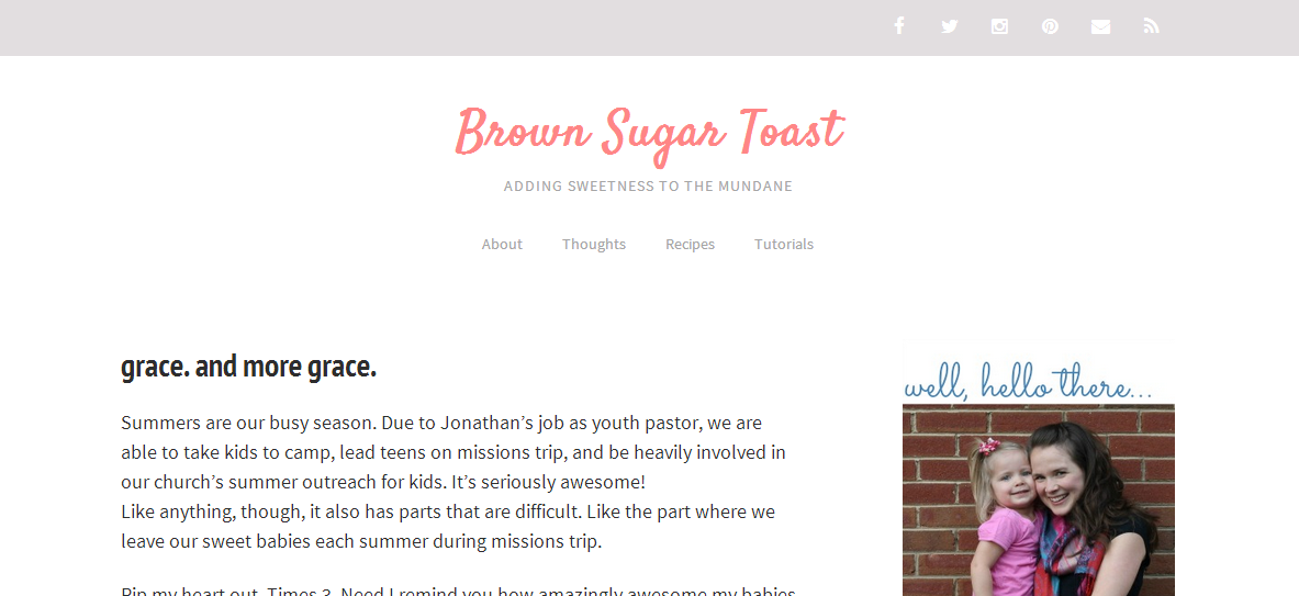
For the past few months, the design of this site has been getting on my nerves. Everything was so cluttered. I kept seeing different sites that I loved and I finally realized what they all had in common. They were simple. Clean. Uncluttered. And they were beautiful.
I am clearly not a graphic designer. Nor am I good at behind the scenes computer coding craziness. And so I was super hesitant to try to change anything because I just knew it would take a meeellion years.
Lo and behold. The new site design has arrived. And a meeellion years have not passed.
If you’re reading this via email, click here to see the clean + simple loveliness.
One of my fave features is the mobile version. I mean, seriously. How long does it take a girl to get a decent mobile version of her site? Clearly it takes a long time. But now you see this… {excuse the top & bottom parts that I was too lazy to crop out of the screenshots.}
And if you want to get to a specific topic, just click on the “Menu” and this drop down list will appear:
OR you can scroll to the bottom to either search the site or check out the most recent posts.
There may still be some wonky issues, so if you see any, please let me know via facebook or email {brownsugartoast {AT} gmail {DOT} com}.
So far, though, I just breathe a sigh of relief every time I see the new design.
Ahhhh…so clean + simple. I love it.


